
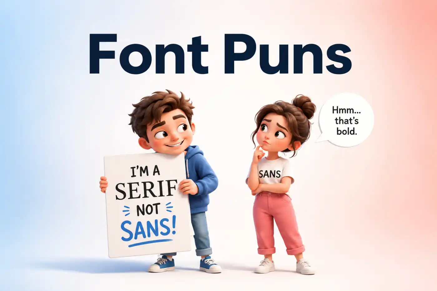
Font puns can turn a plain sentence into something bold, witty, and impossible to scroll past. A clever typeface joke can bring a smile to designers, writers, students, and anyone who enjoys playful wordplay.
Letters might look small on a screen, yet they can carry a big punchline. From serifs and spacing to typography and text styles, there is plenty of room for a good laugh frome font puns.
.
This collection font puns brings together shareable humor built around familiar typography terms and everyday moments. Each pun stays easy to understand, quick to copy, and ready for captions, texts, cards, or conversations.
Font Puns For Designers And Creatives
Creative minds spend plenty of time choosing typefaces and arranging text. These playful lines bring some humor to the details that designers notice every day.
- Kerning gets personal when two letters stand a little too close.
- Designers don’t need magic. They need the right font and a working undo button.
- A typeface walked into a studio and asked for a creative brief.
- White space took the day off and suddenly everyone noticed.
- Good design starts with a vision and ends with someone asking for one tiny change.
- The font menu has more choices than most people need before breakfast.
- A designer knows trouble starts when someone says make it pop.
- Alignment keeps the peace by putting everyone in the right place.
- Typography has one golden rule. Never underestimate the power of spacing.
- A creative director asked for something fresh and received twelve new font combinations.
- Serif showed up with confidence while Sans Serif kept things simple.
- Designers can spend twenty minutes choosing a font and two hours explaining the choice.
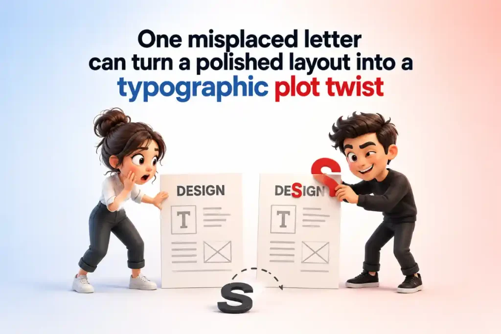
- One misplaced letter can turn a polished layout into a typographic plot twist.
- The grid never complains because it knows everyone needs structure.
- Bold text doesn’t enter quietly. It makes a headline entrance.
- Italics always lean into difficult conversations.
- A designer’s favorite shortcut is anything that saves three clicks.
- Every typeface wants attention, but display fonts make the loudest entrance.
- Good kerning brings letters together without starting a spacing argument.
- The best layouts know when to speak and when to leave some white space alone.
- A designer finished the project and celebrated by opening the font menu again.
Funny Advice:
Send these to a creative friend after a long design session. The spacing argument line works especially well when everyone has debated kerning for far too long.
Font Jokes For Writers And Word Lovers
Writers spend their days with words, sentences, punctuation, and pages. Naturally, typography gives them plenty of material for a clever laugh.
- Writers love fonts because every story deserves the right voice.
- A novelist chose a typeface and suddenly the manuscript had better character.
- Words asked for more room, so the writer adjusted the margins.
- Punctuation joined the meeting and immediately started making points.
- A comma walked into a sentence and decided to take a pause.
- Writers don’t fear blank pages. They negotiate with them.
- The manuscript looked perfect until someone spotted one stubborn typo.
- A good typeface can make a rough draft look surprisingly confident.
- Paragraphs appreciate personal space just as much as people do.
- One letter went missing and the entire sentence filed a formal complaint.
- Writers know every chapter needs a strong opening and a decent coffee break.
- The dictionary never runs out of words because it knows how to keep things in character.
- A semicolon joined two thoughts and called it a compromise.
- Long sentences need room to breathe, especially after a dramatic plot twist.
- The editor circled a typo and the writer called it a character development moment.
- A headline walked onto the page and immediately demanded attention.
- Writers trust words, but they keep a close eye on autocorrect.
- A paragraph without spacing is basically a crowded room for letters.
- Good typography lets the story speak without shouting.
- The final draft looked polished until the writer discovered one more typo.
- Every writer deserves a font that makes the page say keep going.
Funny Advice:
Share these font puns with a writer friend during a deadline. A well timed character development moment can make even an editing session a little more entertaining.
Font Jokes That Make Words More Fun
Typography already has plenty of personality, so a little wordplay fits right in. These jokes give letters, styles, and printed words a playful turn.
- Bold fonts never whisper when they have something to say.
- Arial walked into the room and announced that it was time to get serious about spacing.
- Comic Sans keeps getting invited because somebody has to bring the laugh track.
- Times New Roman arrived late and blamed the old schedule.
- Helvetica refused the drama and chose a clean character arc.
- Garamond got promoted after showing excellent type of leadership.
- Calibri entered quietly but still made a capital impression.
- Courier always delivers, especially when the message needs proper character.
- Verdana brought snacks because good typography needs strong support.
- Baskerville took a break and called it a well deserved line rest.
- Georgia never rushes because good letters deserve room to breathe on the page.
- Futura keeps talking about tomorrow because the name gives it a head start.
- A font walked into a bar and asked for something on the rocks and in italics.
- Kerning became popular after learning how to close the gap.
- Serif fonts enjoy tradition because they always keep their feet on the page.
- Sans Serif prefers simple plans with no extra ends attached.
- Every typeface wants respect, but some demand to be all caps about it.
- A good font knows when to stand out and when to mind its margins.
- Typography students never lose arguments because they always have a strong point size.
- One letter asked another for space and got a well kerned response.
- Fonts have plenty of character, which explains why some of them become type stars.
Funny Advice:
Drop one into a message for a writer, designer, or book lover. A well placed type star pun can turn an ordinary chat into something worth remembering.
Funny Font Puns For Designers
Designers spend plenty of time choosing the right typeface, so these jokes speak their language. A little typography humor can make even a long project more entertaining.
- Choosing a font is easy until one thousand opinions enter the chat.
- Designers spot bad kerning faster than most people spot a typo.
- Helvetica walked into the meeting dressed for business and baseline alignment.
- Comic Sans saw the serious presentation and whispered this needs more fun.
- A designer’s favorite workout is lifting font weight.
- Tracking went to therapy because it needed help with personal space.
- Typography meetings get tense when everyone wants to be the leading character.
- Garamond skipped the trend and stayed classically stylish.
- A design project isn’t finished until someone says try another font.
- Serif and Sans Serif started a debate, but neither could find a common line.
- Designers don’t judge people, but they do notice questionable letter choices.
- Every creative brief eventually leads to someone asking for just one more revision.
- Italics lean into every conversation with plenty of sideways confidence.
- Bold text enters a page like it already owns the place.
- Tiny font sizes have big dreams but struggle to get noticed.
- Designers trust grids because even letters need a good support system.
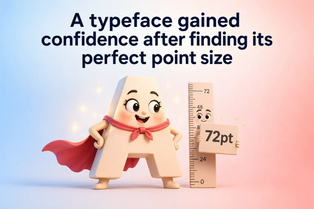
- A typeface gained confidence after finding its perfect point size.
- White space got invited because it knows how to make everyone else look better.
- Display fonts love attention and never pretend otherwise.
- A designer opened the file and discovered Arial again, which answered every question.
- Good typography is like good timing because one small adjustment can change the whole page mood.
Funny Advice:
Save a few font puns for work chats with creative friends. Typography humor works best when everyone has survived at least one just one more revision request.
Font Puns For Instagram Captions
Short captions work best when they have personality. These playful lines give posts a little extra character without taking up the whole screen.
- Serving bold choices one letter at a time.
- Today’s style comes with excellent type appeal.
- Keeping life neat with proper spacing.
- Too polished to settle for default settings.
- Letters lined up and decided to make an entrance.
- Making every word count and every caption look good doing it.
- Just another day of staying inside the margins.
- Small details deserve big attention.
- Giving this post a little extra character.
- Clean lines and good times.
- Typography first, explanations later.
- Some people chase trends. I chase better letterforms.
- Keeping the look sharp and the spacing sharper.
- Words dressed up for the occasion.
- Page goals with a side of bold confidence.
- A good caption needs timing, style, and a decent typeface.
- Turning ordinary text into something worth stopping for.
- No clutter, just letters with attitude.
- Staying aligned with the good stuff.
- Adding personality one character at a time.
- Proof that even a simple sentence can dress to impress.
Funny Advice:
Pair one with a photo of your workspace, book, design project, or coffee break. A caption with letters with attitude can give a simple post more personality.
Typography Puns For Clever Wordplay
Typography offers more than fonts. Kerning, leading, ligatures, spacing, and letterforms create plenty of opportunities for sharp wordplay.
- Kerning and I have one goal in life: keeping close without crowding.
- Leading always gets ahead because it literally knows what comes next.
- Ligatures make great couples because they know how to stick together beautifully.
- Baseline never panics because it knows where to draw the line.
- Tracking enjoys a long walk as long as nobody messes with the spacing.
- Point size got ambitious and started thinking bigger.
- A lowercase letter entered the room and kept a low profile.
- Capital letters bring confidence without needing an introduction.
- White space doesn’t say much, but it makes a strong statement.
- Letterforms make excellent friends because each one brings a different character.
- Alignment solved the disagreement by getting everyone on the same page.
- Leading showed up early and waited patiently above the next line.
- A ligature said commitment was easy when both sides fit together naturally.
- Spacing took a vacation and finally got the distance it had been asking for.
- Baseline keeps the group grounded during every design emergency.
- Uppercase letters never hide from a challenge.
- Lowercase letters prove that quiet confidence can still make an impact.
- Kerning experts know that relationships often come down to a little room and good timing.
- Typography teachers never lose their place because every line knows where it belongs.
- Letter spacing became fashionable after discovering the beauty of giving things room.
- A good layout works like a good conversation because nothing should talk over everything else.
Funny Advice:
Use these lines when chatting with someone who loves books, design, or writing. A clever same page pun can also add a playful touch to a card or message.
Font Puns For Romantic Messages
Love letters deserve more than plain words, don’t they? These playful puns mix romance with typography for messages that bring a smile.
- You’re my favorite type in every possible way.
- My heart chose you in bold print and never looked back.
- Our story has excellent spacing and no need for revisions.
- Every love note looks better with your name on the page.
- You’re the perfect match in my font family.
- Life with you has all the right characters.
- My heart keeps putting your name in italics for extra emphasis.
- You’re the reason my love letters never need a better draft.
- Some connections need editing. Ours reads beautifully from the first line.
- You’re my favorite reason to write another chapter.
- Romance looks better when we’re on the same baseline.
- My thoughts keep returning to you like a sentence that deserves another read.
- You’re the serif to my sentence and the charm in every line.
- Our love story has strong character and excellent timing.
- Even white space looks better when you’re nearby.
- My heart has plenty to say, but your name still gets the largest font size.
- You’re the highlight I never want to remove.
- Every page of life looks better with you beside me.
- Our connection has better chemistry than the perfect ligature.
- Love gave me plenty of words, yet you became my favorite line.
- You’re the one person I’d never place in the fine print.
Funny Advice:
Send one in a sweet text, card, or playful note. A line like favorite type can make romance a little more memorable without becoming overly serious.
Font Puns For Everyday Laughs
Fonts show up everywhere, so why not let them bring a few laughs too? These playful lines can brighten a text, conversation, or ordinary moment.
- Comic Sans walked into the room and instantly became the life of the paragraph.
- Monday arrived in a font so small that nobody wanted to read it.
- Arial keeps things simple because drama takes up too much page space.
- Lunch looked much better after somebody added a little font seasoning.
- Coffee deserves to be written in the largest point size available.
- Weekend plans appeared in bold because they refused to be ignored.
- Homework looked less intimidating after the heading got a fresh typeface.
- Meetings become easier when everyone agrees to keep the discussion well aligned.
- A good book never judges its readers by their preferred font.
- Deadlines always arrive with an uncomfortable amount of bold emphasis.
- Emails look friendlier after removing the unnecessary ALL CAPS DRAMA.
- One tiny typo can turn a polished sentence into a character crisis.
- Notes become far more important once somebody writes urgent in bold.
- Reading glasses deserve credit for helping small fonts step into the spotlight.
- A clean page gives every word room to stretch its legs.
- Autocorrect keeps changing the script without asking for editorial approval.
- Some messages need a reply while others deserve a complete font change.
- A handwritten note has character even when the letters wander off course.
- Good handwriting and good typography both know how to make an entrance.
- One missing letter can send the whole sentence in a different direction.
- Life gets easier when the important stuff comes with clear instructions and readable text.
Funny Advice:
Slip one into a group chat when work, school, or daily life gets a little dull. A quick character crisis pun can bring a welcome laugh.
Font Puns For Captions And Posts
A strong caption can stop a scroll faster than a flashing notification. These playful lines give photos and posts a sharp dose of typography humor.
- Bold enough to be noticed and stylish enough to be remembered.
- Serving looks with proper letter spacing.
- Today’s plans are written in my best typeface.
- Keeping the caption clean and the personality fully loaded.
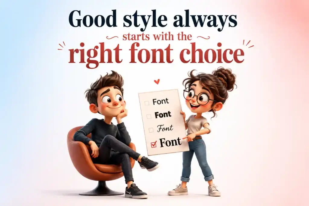
- Good style always starts with the right font choice.
- Posting this before somebody suggests Comic Sans.
- Life looks better with a little extra leading.
- Some days call for quiet text and others demand full display mode.
- Bringing main character style to every line.
- This post has excellent form and even better character.
- Spacing matters, especially when taking photos and making plans.
- Keeping things centered without losing my edge.
- A little typography can make a big statement.
- Looking good from every letterform angle.
- No need to shout when the style already speaks loudly.
- Just giving this moment the bold treatment.
- Clean design and a caption with something to say.
- My mood today comes in a highly readable format.
- Making space for the good stuff and the better letters.
- This picture deserved more than a default caption.
- Some posts fade away. This one came with strong visual character.
Funny Advice:
Match one with a selfie, desk photo, book stack, or creative project. A little font choice humor can give your post a clever twist.
Typeface Puns That Bring Big Character
Typefaces have their own personalities, quirks, and reputations. That makes them perfect material for playful jokes that writers and designers can appreciate.
- Helvetica never overexplains because clean confidence speaks for itself.
- Georgia showed up polished and ready for a proper introduction.
- Baskerville carries itself like it owns an old library.
- Futura keeps making plans for the years ahead.
- Verdana refuses to disappear, even on the busiest screen.
- Courier takes every message personally and makes sure it arrives with full character.
- Garamond enjoys a quiet evening with a good book and elegant margins.
- Impact enters every room like an announcement nobody can miss.
- Calibri keeps the peace by looking appropriate almost everywhere.
- Papyrus keeps trying to join the conversation and sparks another debate.
- Century Schoolbook still knows how to make a classroom look respectable.
- Trebuchet enjoys being different without making a whole speech about it.
- Copperplate dresses for every occasion as if somebody might take a portrait.
- Didot has excellent posture and knows exactly how good it looks.
- Rockwell prefers sturdy plans and dependable company.
- Bodoni arrives dressed for an evening where everyone notices the details.
- Gill Sans keeps things modern without forgetting where it came from.
- Franklin Gothic brings enough confidence to handle any headline.
- Palatino makes even an ordinary sentence look ready for a special occasion.
- Optima proves that simplicity can still have plenty of style points.
- Times New Roman keeps returning because some classics refuse to leave the page.
Funny Advice:
Share these with a typography fan who has strong opinions about typefaces. Just be prepared for a full debate after mentioning Papyrus.
Font Puns For Birthday Cards And Celebrations
A card becomes more memorable when the message has a playful twist. These puns can add a little extra charm to birthdays and celebrations.
- Happy birthday to someone who deserves the biggest font on the page.
- Another year older and still looking bold and beautiful.
- Your birthday deserves more than regular text. It deserves a headline moment.
- Age is just a number, so let’s choose a nicer typeface for it.
- Celebrating you in large print because small gestures won’t do.
- Cake, candles, and excellent typography make a strong combination.
- Today’s date deserves to be circled, centered, and written with extra flair.
- Growing older has never looked this well formatted.
- Birthdays prove that every year deserves another chapter and a better heading.
- May your day come with good company and zero typo moments.
- Another trip around the sun deserves a properly designed celebration.
- Candles may add up, but your style remains well spaced.
- The birthday star gets full permission to take up all the page space.
- Good wishes look even better when written with big character.
- Your special day should never come in fine print.
- Turning another year older calls for a message with bold confidence.
- Cake disappears quickly, but a good pun sticks around longer.
- Every birthday deserves a caption worth keeping.
- Your age remains classified under decorative typography.
- Today’s celebration has one clear headline. You.
- Another year has been added to your story, and the plot still looks good.
Funny Advice:
Write one inside a birthday card or send it with a celebration photo. A playful headline moment can make a simple greeting stand out.
Font Puns For Love And Flirty Texts
Typography can add a playful spark to romance without making a message too serious. These lines work well for a crush, partner, or someone who enjoys clever wordplay.
- You’ve got my attention in every font size.
- My heart keeps making your name bold without permission.
- Our connection has better spacing than most love stories.
- Somehow you became the highlight in every ordinary day.
- You’re the person I’d choose even if every font menu disappeared.
- Romance looks much better when your name appears in the message.
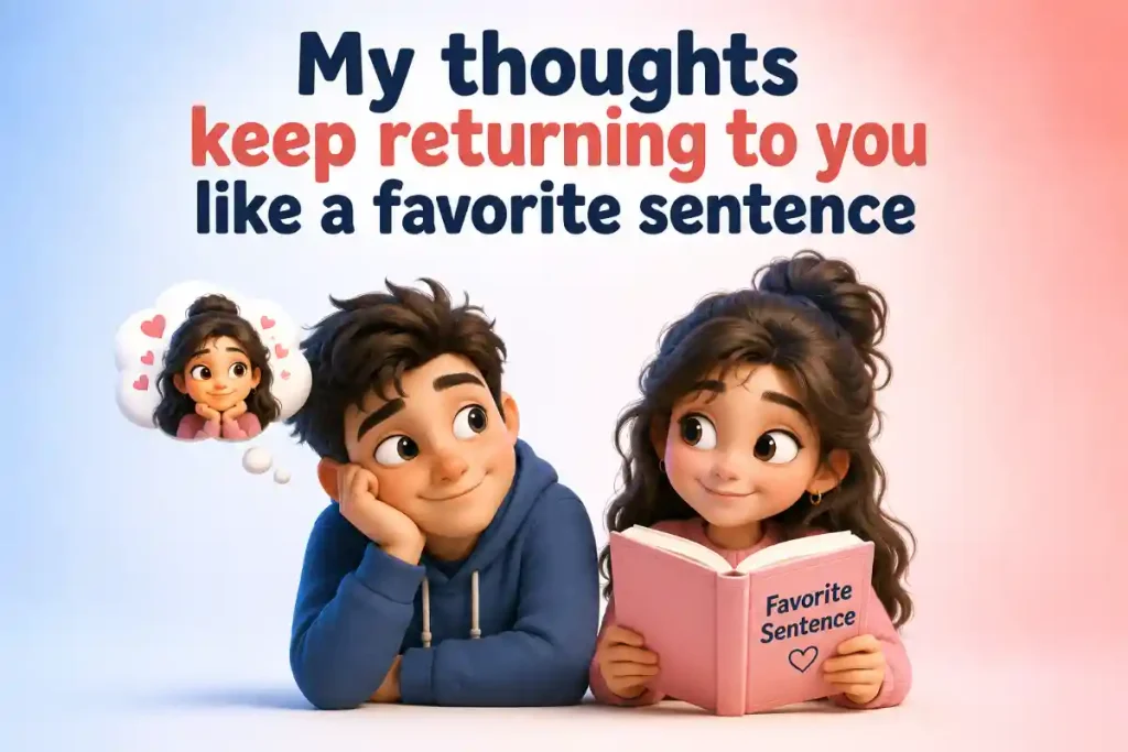
- My thoughts keep returning to you like a favorite sentence.
- You’ve got more character than every typeface on my computer.
- Our story deserves a cover, a title, and a very good opening line.
- One smile from you can change the entire layout of my day.
- My heart doesn’t need autocorrect when it comes to your name.
- You make even my quiet moments look beautifully formatted.
- Every good love story needs chemistry. Ours also has excellent kerning.
- Your charm deserves more than a footnote.
- My favorite messages are the ones that begin with your name.
- Something about you keeps pulling my attention back to the same page.
- I’d give you all the space you need, but I’d still hope to stay close.
- Our timing has been better than a perfectly placed line break.
- Your name has become my favorite piece of text.
- Love can be complicated, but liking you is written in clear type.
- Some people are hard to read. You became my favorite story to keep reading.
Funny Advice:
Send one when a conversation needs a playful spark. A clever layout of my day line can add charm without making things too heavy.
Conclusion
These Font Puns show that letters can do much more than carry a message. A smart typeface joke can add humor to captions, cards, conversations, and even a sweet message to someone special.
Got a favorite pun from this collection? Share it with a designer, writer, teacher, or typography lover who would appreciate the wordplay. You can also post your best Font jokes on social media and invite others to add their own clever lines.
After all, good humor is a lot like good typography. When the timing is right, every word lands exactly where it should.

Max has a knack for spotting the funny side of life and turning it into clever puns. A self-proclaimed joke collector, he spends his free time reading comics, playing word games, and making anyone around him crack a smile.
1 thought on “260+ Font Puns ✍️ TypoTonic Sharp Humor Sparks”