
Font puns always catch me off guard in the best way. I use them in design talks, random chats, and even in captions because they just work.
I trust these jokes because I have spent time around designers and creators who live for clean visuals and clever wordplay. These font puns are simple, sharp, and easy to share anywhere.
Font Puns For Designers
Font puns for designers are perfect for graphic artists, typographers, and anyone who has spent way too long choosing between two nearly identical typefaces. These jokes bring plenty of character, spacing, and style.
- Helvetica walked into a meeting and everyone said, “There you are again.”
- Comic Sans applied for respect and got rejected in bold.
- Serif fonts always seem to have a point.
- Kerning mistakes keep pushing people apart.
- Typography class taught me how to handle character issues.
- Bold font never whispers its opinions.
- Italics leans into every conversation.
- Sans serif fonts cut corners and call it modern design.
- Letter spacing ruined a perfectly good relationship.
- Typefaces have character, some just have too much of it.
- Font designer spent hours searching for the right type of commitment.
- Comic Sans keeps showing up uninvited to professional events.
- Kerning is proof that tiny gaps can cause huge problems.
- Bold text enters every room like it owns the paragraph.
- Typography experts always know how to make a good impression.
- Font arguments usually escalate quickly into character attacks.
- Script fonts never stop showing off.
- Designers spend half their lives choosing fonts and the other half defending them.
- Every great design starts with a type of vision.
- Serif and sans serif have been competing longer than most sports rivalries.
Pro Tip: Font puns land best when they reference typography terms like kerning, serif, sans serif, italics, bold text, and typefaces. Designers instantly recognize the jokes, making them more relatable and shareable.ng too hard.
Font Puns For Social Media Captions
Font puns for social media captions add a little typographic humor to posts, design content, and creative projects. These jokes are perfect for designers, typography fans, and anyone who spends too much time choosing between fonts.
- Comic Sans walked into the meeting and nobody took it seriously.
- Serif font always adds a little extra character.
- Helvetica keeps showing up because it knows it is a safe choice.
- Bold font entered the chat and immediately took over.
- Kerning issues have separated many good friendships.
- Typography lovers never miss the fine print.
- Italics lean into every conversation.
- Font selection took longer than the actual project.
- Sans serif likes keeping things clean and uncomplicated.
- Letter spacing can turn a good day into a design emergency.
- Bold text never whispers its opinions.
- Typeface drama starts when everyone has a favorite font.
- Script fonts treat every word like a formal event.
- Design project paused for another font identity crisis.
- Uppercase letters arrived louder than necessary.
- Font menu contains more plot twists than most movies.
- Kerning mistakes are the typographic version of stepping on a rake.
- Serif and sans serif still disagree on almost everything.
- Typography enthusiasts notice problems nobody else can see.
- Font choice changed five times before this caption was finished.
Pro Tip: Font puns work best for graphic design posts, branding content, typography reels, and creative portfolios. Jokes about Helvetica, Comic Sans, kerning, serif fonts, and bold text tend to connect most with design-minded audiences.
Font Puns For Designers Life
Designers spend half their time choosing fonts and the other half defending those choices. These font puns are made for graphic designers, typographers, and anyone who’s lost an hour comparing two nearly identical typefaces.
- Designer spent three hours picking a font and called it productivity.
- Helvetica keeps getting hired because it already knows everyone.
- Client asked for something unique and then chose the default font.
- Comic Sans entered the project and the meeting got tense.
- Kerning issues create job security for designers.
- Bold font never waits for permission to speak.
- Designer changed fonts seventeen times and ended up back at the first one.
- Typography debates last longer than most design projects.
- Serif font arrived overdressed for a simple flyer.
- Client requested modern, timeless, playful, serious, and bold all at once.
- Italics always look like they’re hurrying somewhere.
- Font menu contains more options than life decisions.
- Designer stared at two fonts and called it research.
- Poor kerning can turn a masterpiece into a mystery.
- Sans serif likes keeping things clean and judging everyone quietly.
- Font pairing is basically a dating app for letters.
- Typefaces have more personality conflicts than office coworkers.
- Designer fixed the layout, then the client discovered new opinions.
- Every project begins with confidence and ends with font comparisons.
- Display fonts treat every headline like a celebrity appearance.
Pro Tip: Design jokes land best when they focus on client revisions, font choices, kerning battles, and the endless search for the “perfect” typeface. Those everyday designer struggles are what make typography humor relatable.
Font Puns For Typography Lovers
Typography fans know fonts have personalities, opinions, and occasional rivalries. These font puns are packed with typeface humor, design jokes, and enough kerning chaos to keep any typography lover entertained.
- Comic Sans walked into the project and immediately lost client trust.
- Comic Sans keeps showing up uninvited and acting comfortable.
- Bold text never whispers its opinions.
- Kerning mistakes create more drama than reality television.
- Italics always seem slightly tilted by the conversation.
- Helvetica became popular by keeping things simple and minding its spacing.
- Font designer broke up with bad typography and moved on gracefully.
- Sans serif claimed it didn’t need extra decoration to stand out.
- Letter spacing got too close and things became awkward.
- Typography conference ended with a lot of mixed type signals.
- Capital letters enjoy making a big impression.
- Font family reunion featured several characters with identical roots.
- Typewriter font refuses to modernize and takes pride in it.
- Bold and italics entered a competition and neither could stay straight.
- Poor kerning turned a perfectly good word into a public misunderstanding.
- Script font signs everything with unnecessary flair.
- Lowercase letters prefer keeping a low profile.
- Display fonts treat every headline like a red carpet event.
- Typography experts always know how to make a point size matter.
- Monospace font insists everyone deserves equal space.
- Comic Sans says confidence matters more than approval ratings.
Pro Tip: Font jokes work best when they reference typography terms like serif, kerning, bold, italics, spacing, and typefaces. Designers and typography enthusiasts usually appreciate jokes that sound like something that could actually happen in a design studio.
Font Puns For Branding And Marketing
Branding and marketing teams know a font can change an entire campaign. These font puns mix typography, logos, and marketing chaos into jokes that designers, marketers, and brand managers will appreciate.
- Brand changed its font and suddenly called it a rebranding strategy.
- Marketing team spent six weeks discussing a typeface and called it progress.
- Logo font became famous before the product did.
- Serif font walked into the campaign and brought instant credibility.
- Brand identity crisis started with one innocent font swap.
- Marketing meeting lasted longer than the font shortlist.
- Bold font never pays for advertising because it gets noticed anyway.
- Rebranding project began with confidence and ended with forty font options.
- Client asked for a fresh look and picked the same font again.
- Font choice carried more pressure than the product launch.
- Brand voice got louder the moment bold text arrived.
- Marketing team called it strategy, typography called it survival.
- Sans serif keeps winning because it knows how to stay on message.
- Logo redesign added one new font and three hundred new opinions.
- Every successful brand starts with a font and a lot of debates.
- Typeface entered the campaign and stole all the attention.
- Marketing slogan looked brilliant until the font joined the conversation.
- Brand guidelines are mostly instructions on how not to upset the designer.
- Font pairing created more chemistry than the ad campaign.
- Rebrand budget vanished somewhere between the logo and the typography review.
Pro Tip: Branding and marketing font jokes work best when they focus on rebrands, logo updates, client feedback, endless revisions, and typography debates. Those real-world situations make the humor more relatable and memorable.in marketing posts or client pitches to sound sharp and strategic.
Font Jokes For Coding And Tech That Compile Clean Humor
Coding and tech teams know fonts are never “just fonts” — they’re part of debugging, UI chaos, and late-night design decisions. These font puns mix typography with coding life for developers, designers, and tech lovers.
- Developer changed the font and called it a UI bug fix.
- Console output looked fine until Comic Sans appeared.
- CSS said “font-family,” but reality said “font chaos.”
- Debugging started after the font stopped aligning with logic.
- Helvetica compiled successfully without any warnings.
- Frontend dev blamed spacing issues on “unexpected kerning.”
- Code looked perfect until the font rendered differently in production.
- Terminal font refuses to express emotions but still causes errors.
- One font update broke the entire dashboard and morale.
- UI design crashed after mixing serif with bad decisions.
- Developer said it’s not a bug, it’s a font feature.
- React app rendered fine until typography got involved.
- Monospace font keeps everything aligned, including expectations.
- Backend doesn’t care about fonts, but frontend never forgets.
- CSS class named “.font-issue” became the most used file.
- Design system failed because everyone had a different favorite font.
- Code review turned into a typography debate.
- Font rendering bug fixed itself after restarting the browser twice.
- Dev stack: coffee, errors, and questionable font choices.
- Pixel-perfect UI lasted exactly one browser update.
Pro Tip: Font jokes in coding and tech work best when they reference CSS, UI bugs, rendering issues, debugging, and developer workflows. That makes them instantly relatable to anyone in software or product design.
Font Jokes For Students And Learning That Pass Every Test of Humor
Students know fonts show up everywhere from assignments to presentations, and sometimes they cause more confusion than exams. These font puns mix school life, learning struggles, and typography jokes for a light classroom laugh.
- Student changed the font and called it a study breakthrough.
- Assignment looked smarter immediately after switching to serif.
- Lecture notes became unreadable after Comic Sans entered the chat.
- Homework deadline stayed the same, font choices did not.
- Teacher said “keep it simple,” so the font family exploded.
- Study presentation spent more time choosing fonts than learning content.
- Italic text always looks like it’s rushing to submit work.
- Bold headings tried to carry the entire assignment.
- Group project failed after everyone picked a different font.
- Monospace font kept the essay more organized than the student.
- Student discovered that font size cannot replace knowledge.
- PowerPoint slides got a personality after changing typography three times.
- Assignment improved instantly after pretending font fixes everything.
- Teacher asked for clarity, student delivered four font options.
- Notes looked serious until playful fonts showed up uninvited.
- Study plan included 20% learning and 80% font testing.
- Font choice became the main topic of the presentation.
- Homework survived formatting changes but not confidence levels.
- Exam revision notes argued with each other through different fonts.
- Learning got delayed by “just one more font check.”
Pro Tip: Font puns for students work best when they highlight real study habits like procrastination, presentations, group projects, and over-formatting assignments instead of focusing only on typography terms.
Font Jokes For Memes And Humor That Speak in Comic Sans Energy
Font puns for memes and humor take typography chaos, internet jokes, and design randomness and turn them into captions that fit anywhere online. These jokes are made for meme lovers who know a font can ruin or save the punchline.
- Meme switched fonts and instantly lost credibility.
- Comic Sans showed up and said, “Let’s make this worse.”
- Bold text entered the meme and stole the punchline.
- Caption looked serious until the font started acting funny.
- Serif font tried to be dramatic but got meme-ified.
- Internet rule: funny content gets funnier in the wrong font.
- Meme quality dropped after Helvetica got involved.
- Italics always look like they’re whispering the joke too late.
- One font change turned chaos into comedy gold.
- Meme template complained about poor typography choices.
- Sans serif said, “I don’t need decoration, just jokes.”
- Font alignment issues made the meme even more relatable.
- Caption laughed first, font laughed louder.
- Meme got approved only after switching to something less serious.
- Typography errors accidentally improved the humor.
- Bold font refuses to let the joke be subtle.
- Meme went viral after accidental Comic Sans appearance.
- Every good joke starts with bad formatting choices.
- Font family reunion turned into a meme convention.
- Screenshot survived compression but not font criticism.
- Humor level increased immediately after ignoring design rules.
Pro Tip: Font memes work best when they exaggerate bad design choices, unexpected font swaps, and chaotic formatting. The more “wrong” it looks, the funnier it usually becomes online.en creating memes or captions to boost engagement naturally.
Font Jokes For Business And Work
Font puns for business and work turn meetings, deadlines, branding chaos, and office decisions into typography humor. These jokes fit workplace chats, marketing teams, and anyone who knows font choice can delay a project for hours.
- Meeting started on time, but font discussion didn’t.
- Business proposal improved instantly after switching to a serious font.
- Client said “make it professional,” then picked Comic Sans.
- Office email became louder the moment bold text arrived.
- Helvetica is basically the corporate employee of fonts.
- Brand identity changed three times and still used Arial.
- Presentation lasted 10 minutes, font debate lasted 40.
- Marketing strategy failed after typography disagreement.
- Every business idea looks better in a confident font.
- Font selection became the real KPI of the project.
- Serif font walked into the boardroom with authority issues.
- Spreadsheet got emotional after inconsistent formatting.
- Corporate logo survived redesign, barely.
- Business email gained attitude after switching to all caps.
- Client feedback mostly involved font confusion.
- Branding team called it “alignment issues,” fonts called it chaos.
- Every deadline comes with last-minute font panic.
- PowerPoint slides changed fonts more than content.
- Office productivity depends on agreeing on one typeface.
- Bold decisions usually start with bold text.
Pro Tip: Business font humor works best when it highlights real office situations like meetings, branding debates, client revisions, and presentation formatting struggles.
Font Puns For Everyday Life That Keep Things Properly Spaced
Font puns for everyday life turn normal routines, small mistakes, and random moments into typography humor that fits almost any situation. These jokes are simple, relatable, and easy to drop into captions, chats, or daily posts.
- Life updated its font and still seems the same chaos.
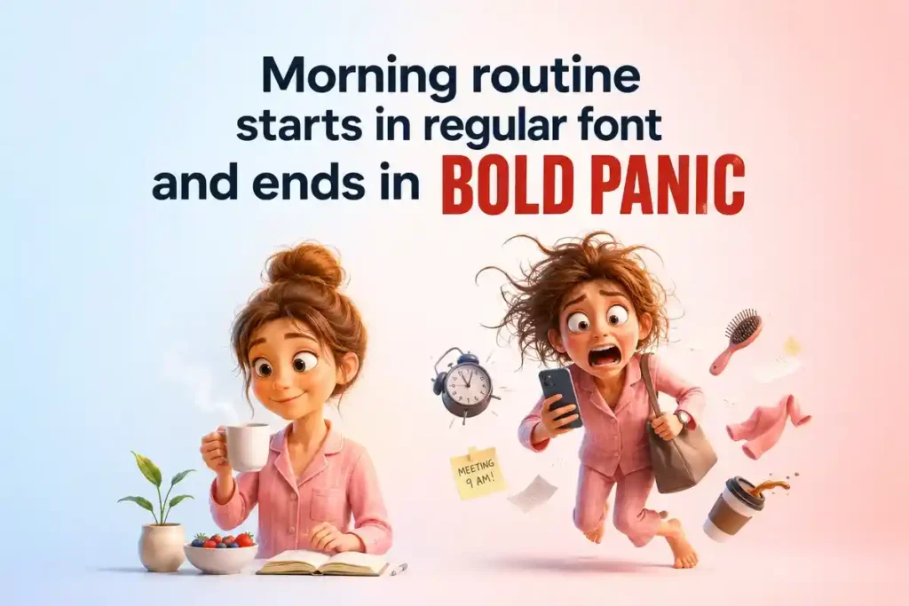
- Morning routine starts in regular font and ends in bold panic.
- Coffee fixes everything except bad kerning decisions.
- Everyday plans look better in theory and worse in Arial.
- Monday arrived in italics, already leaning sideways.
- Text message changed tone after switching to all caps.
- Life becomes better when everything is evenly spaced.
- Small mistakes become big headlines in bold font.
- Daily schedule keeps shifting fonts without warning.
- Mood changes faster than a font preview dropdown.
- Grocery list looks serious until Comic Sans shows up.
- Every task feels lighter in a clean sans serif font.
- Reality checked the font and still refused alignment.
- Notifications always arrive in urgent bold typography.
- Life updates should come with better font choices.
- Routine gets messy when spacing is ignored.
- Every plan starts structured and ends poorly formatted.
- Text conversations depend heavily on font interpretation.
- Simple day turns complicated after formatting errors.
- Life would improve with a universal font reset.
- Everyday moments look better when properly aligned.
Pro Tip: Everyday font puns work best when they connect typography ideas like spacing, bold, italics, and font changes with real-life routines, making the humor easy to understand and relatable.
Conclusion
Font puns turn something simple like typography into a creative way of expression. They make design everyday conversation, fun, and easy to connect with.
If you enjoyed these font jokes then share them with friends or drop your favorite one in the comments. Good creativity always deserves to be shared.
FAQs
What Are the 5 Types of Fonts?
Fonts are usually grouped into five main styles: serif, sans serif, script, display, and monospace. Each one has its own vibe, from traditional and formal to modern, decorative, or typewriter-style text.
Who Made the First Font?
The first widely recognized movable type font is credited to Johannes Gutenberg in the 15th century. His printing press used metal type that helped standardize writing and made books far more accessible.
What Are the 4 Main Fonts?
The four main font families are serif, sans serif, script, and decorative. These cover most of what you see in books, websites, branding, and design work today.
What Is the Original Font?
There isn’t one single “original font,” but Blackletter is often considered one of the earliest widely used type styles in printed books, especially in early European printing history.
What Are the 4 Types of Font?
The four basic font types usually refer to serif, sans serif, script, and display. Designers use them to create different moods, from clean and modern to artistic or bold.
What Is the 47 Font Style?
“47 font style” isn’t an official typography category. It’s often seen online as a mix-up or a casual way people refer to a large collection of fonts or a specific design pack. There’s no standard font system with 47 defined styles.

Max has a knack for spotting the funny side of life and turning it into clever puns. A self-proclaimed joke collector, he spends his free time reading comics, playing word games, and making anyone around him crack a smile.